
Bobble of the Day
Player: Corey Seager
Team: Rancho Cucamonga Quakes
Year: 2015
Manufacturer: Promotional Adventures
One of the rising stars in all of baseball, Mr. Corey Seager. This dude has been an absolute star in the making and the Quakes did this right by handing out a bobble of him back on June 13th, 2015. The first 1,500 fans through the gates were handed a bobble of the now “Rookie of the Year” for the Dodgers.
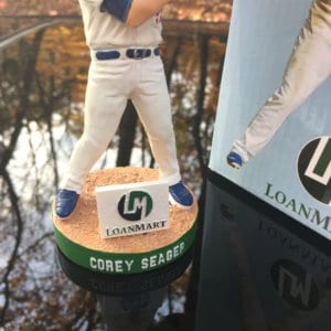
Big collector’s, including myself get caught up in uniqueness and how flashy a company makes a bobblehead. If you take a step back and just appreciate the simple style of a bobblehead, you’ll have a better understanding how valuable one can be. This bobble doesn’t blow the shingles off the fucking roof by any means. It’s a simple stance of Corey Seager in his Quakes uniform with a bat on his shoulder. Boring right? No. No by any means. I don’t like it, I LOVE it. It’s simple. There’s no flashy, crazy design to it. He’s not sliding or diving for a ground ball. He’s just standing there and I love everything about it. To me, it just looks professional. No glamour. Just straight to the point. And by all accounts, it’s of a great player.
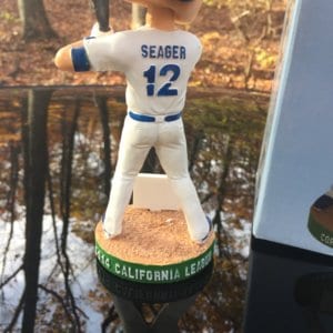
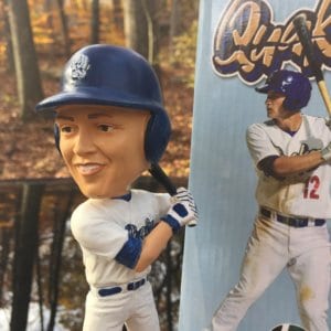
The base is thick and is outlined with a green strip and has a dirt layer on the top replicating he’s standing in the batter’s box. The blue cleats look dope and his belt and undershirt and helmet all match the color blue. The lettering on the base, his name and number on the back of the jersey and the Quakes logo on the front of his jersey is all raised lettering. No short cuts on this one as Promotional Adventures did a very good job. Lastly, instead of just making a round face with no detail which most SGA’s look like, Promotional Adventures put in some lines which resemble some facial features which adds character to this bobble.
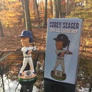
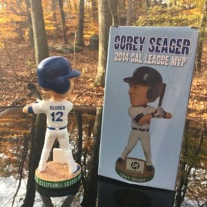
Sniper Rating: So this SGA of Seager is highlighted by him winning the 2014 California League MVP award and deservingly so. The honor of winning a Minor League award is incredible in itself, let alone the mother fucking MVP award! I love the light blue colors on the box as it completely offsets the navy blue colors on his helmet and uniform. On this bobble, simple is better. Straight to the point with a simple stance, a simple base with no flashy design. I love everything about this one and it deserves nothing less than a 9.5 overall rating.
PS. The only knock might quite possibly be the sponsor “LoanMart”. What the fuck is LoanMart? I’d love to see that emblem sponsor be changed to a “Pepsi” or “Coca Cola” sign. Now that would be killer.
Hi There! We are searching for experienced people that are interested in from working their home on a part-time basis. If you want to earn $200 a day, and you don’t mind writing some short opinions up, this might be perfect opportunity for you! Simply click the link here NOW!
Hi There! We are looking for experienced people that might be interested in from working their home on a full-time basis. If you want to earn $100 a day, and you don’t mind writing some short opinions up, this is the perfect opportunity for you! Simply click the link here NOW!